FormStamp Objects
There are eight kinds of objects you can add to a FormStamp. These include: lines, rectangles, grids, plain text boxes, rich text fields (RTF), HTML objects, data fields, and images.
To draw an object, click on the icon for that object in the toolbar. Then, click on the FormStamp where you want to place the object, and draw the object to the desired size. Release the mouse to finish drawing the object. If you click on the FormStamp without dragging, the object will be created at its default size.
To edit the properties for any object, double-click on that object, or right-click on it and go to Format Object.
Object Properties: General
All objects have a General properties tab that lets you edit the name of the object and choose when that object should print on the FormStamp.
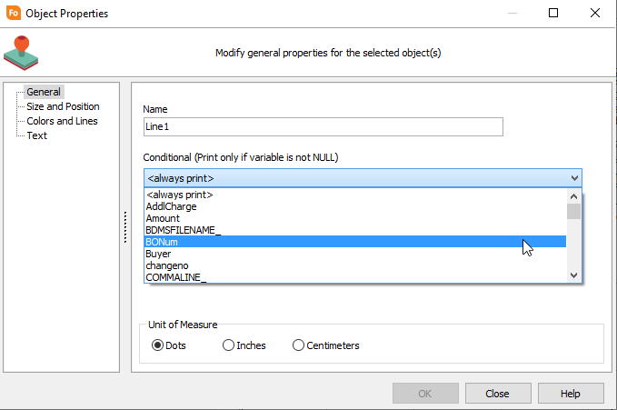
The Conditional field lets you specify that the object should only print if the value of the selected variable isn't null. If the variable is null, the object will not print.
Object Properties: Size and Position
All objects have a Size and Position screen where you can edit the size and the position of the object. You can edit the values manually here, or resize the object using the mouse or keyboard on the FormStamp. (To resize an object on the FormStamp using the keyboard, select the object and use Shift + the arrow keys to adjust the width or height. Using Ctrl + the arrow keys changes the object's position).
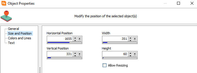
The Allow Resizing checkbox only appears for data field objects, and controls whether or not the size of the field will increase if the data extends past its current dimensions.
Object Types
FormFusion lets you add three kinds of basic shapes to your templates. These include lines, rectangles, and grids.

Lines
Lines in FormFusion can be either horizontal or vertical lines. The Colors and Lines screen in the Object Properties lets you choose the color and thickness (width) of the line.

Rectangles
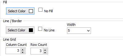
The Colors and Lines screen in the Object Properties allows you to choose a border color, border width, and fill color for a rectangle. If you would like a perfectly square rectangle, go to the Size and Position screen and set the rectangle's width and height to the same value.

Grids
A grid is a rectangle that is divided into cells. It is similar to a table, but the cells in a grid are always of equal size. The Colors and Lines screen in the Object Properties contains the same border, width, and fill options that a rectangle has. For a grid, the border options affect the appearance of the grid lines as well as the border lines. You can also specify the number of rows and columns that the grid should be divided into.
Note: if you want to create actual tables with cells of varying sizes, use an HTML object instead of a grid.
A text object is a plain text field that you can place anywhere on the form to add labels, titles, instructions, etc. You can apply some basic formatting to a text field, but the entire field will have the same formatting options. If you want to use different types of formatting within a text area, use an RTF object or an HTML object.

When editing a text object, notice that you have a "Text" screen in addition to the General, Size and Position, and Colors and Lines screens that all FormStamp options have.
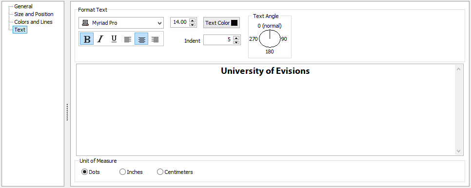
Here, you can specify the font, font size, text color, formatting options, alignment, indentation, and text angle for the text contained in the object. The formatting is applied to all of the text within the object.
An RTF object is similar to a text object, except that it lets you apply formatting to any part of the text that you choose. You also have the option to use FormFusion variables in the text.

When editing an RTF object, notice that you have a Rich Text screen below the General, Size and Position, and Colors and Lines screens that all FormStamp options have.

The Rich Text screen provides basic formatting options such as font, size, color, alignment, and bold/italics/underline for text. The arrows on the vertical ruler bar allow you to adjust the margins of your content. You also have options for line spacing, text highlighting, bullet points, and inserting FormFusion variables.
To view the list of available variables (pulled from MapForm and CaptureForm), click on the sideways Variable Reference tab on the right.
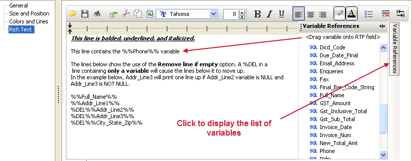
Click on the variable you wish to use and drag it to the desired location in the text. The name of the variable will appear surrounded by double percent signs (%%) indicating that it is a variable.
One useful option you have is to omit a line if it is empty-- e.g., if the line contains nothing but a variable, and that variable happens to be null. The last icon on the toolbar is the Remove if Empty icon, which inserts a special code at the beginning of the current line. Any line prefaced with %Del will be removed from the output if the only thing on the line is a null variable. In this way, you can remove blank lines from your output if no information is printed there.
Note: If the line contains other text besides the (null) variable, then the line will still print the plain text and will not be removed.
The Tab Toggle button  changes the behavior of the Tab key so that it will insert a Tab character instead of tabbing out of the text edit area.
Finally, you have some "file" type options in the RTF toolbar:
- Cut, Copy and Paste copy and paste data to and from the clipboard
- Open and Save let you load in a file saved in RTF format by another application, or save the current contents of the RTF editor to a file for later use.
- Print prints the contents of the RTF object to a printer.
- Undo undoes the last edit you made to the RTF object.
An HTML object lets you enter Hypertext Markup Language (HTML) similar to the HTML you would use to create a website. The advantage of HTML over an RTF object is that it gives you much better control over the layout of the object and the look and feel of the text. The HTML object supports the majority of HTML5 tags, including CSS that you can use to style your content. If you want to control the style and padding for bulleted lists, use tables for layout and for printing data, embed images, hyperlinks, and more, you can!
The HTML screen in the Object Properties window contains an HTML editor and a preview window that updates in realtime to reflect the changes you make in the editor.
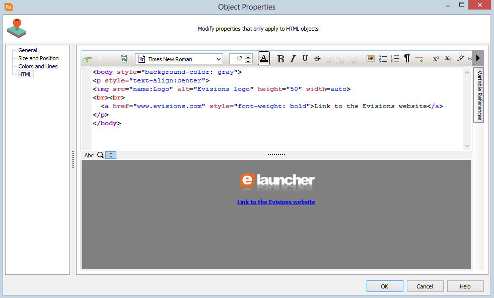
The markup in the HTML edit pane color-codes various parts of the HTML syntax:
- Tags are purple
- Attributes are red
- Attribute values are blue
- Text included in the output is black.
Supported Tags
The toolbar contains various buttons that insert formatted HTML tags for you. You can either use the toolbar buttons, or write your own HTML freehand. Either method will work, as long as you use correctly-formatted HTML5.
Note: Deprecated tags such as the <font> tag are not supported in HTML5. For more information and tutorials on how to use HTML and CSS, you can refer to http://www.w3schools.com/html/. This website is not associated with Evisions, but provides a good basic introduction to HTML.
Clipboard
Use the clipboard buttons to undo, cut, copy, and paste text in the HTML editor.
Font
Choose a font from the dropdown box.

The fonts you see are those installed on the local system where you are running FormFusion. Like fonts used anywhere else in FormFusion, they must be installed both locally and on the MAP server in order to print correctly.
<span style="font-family:Arial;">This text is in Arial.</span>
Font Size
Select the desired font size from the numeric control by either typing a value into the box, or adjusting the number up or down using the arrow buttons.

<span style="font-size:14pt;font-family:Arial;">This text is in Arial size 14.</span>
Note: Using the numeric control to change the size of any text inside existing font size tags will update the tag. If you want to nest fonts or font properties, you can do so by editing the HTML manually.
Font Color
Click the Font Color button to choose a color for the selected text.
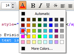
<span style="color:#FF0000;">This text is red.</span>
You can also specify the font color using the name of the color, e.g. "color:red;".
Formatting
The font formatting buttons let you make text bold, italic, underlined, or strikethrough.

This text is <b>bold</b>, <i>italic</i>, <u>underline</u>, and <s>strikethrough</s>.
Paragraph Alignment
Use the alignment buttons to position your text on the left, right, or center.

<p align="left">Left-aligned paragraph</p>
<p align="center">Centered paragraph</p>
<p align="right">Right-aligned paragraph</p>
Images

Click the image button to launch the image dialogue. Then, click the green plus symbol to add an additional image to this HTML object and browse for the file.
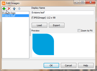
Click OK to insert the tag into the HTML.
The image dialog does not include options for specifying the width and height, only a zoom to fit option to stretch the image to the width of the HTML object. However, these attributes can be specified manually by editing the tag:
<img src="name:Evisions leaf" width="50%">
Unordered (Bulleted) Lists

Clicking the unordered list button inserts a new unordered list, and the list tags for the first element in the list:
<ul><li></li></ul>
Putting the cursor after the closing <li> tag, and clicking unordered list again inserts tags for a second list item:
<ul><li></li><li></li></ul>
In many cases, it is simpler to type the list tags manually. Manual editing of lists also allows for use of sub-lists:
<ul>
<li>List item 1</li>
<li>List item 2</li>
<ul>
<li>Sublist A</li>
<li>Sublist B</li>
</ul>
<li>List item 3</li>
</ul>
Ordered (Numbered) Lists

Ordered lists are similar to unordered lists, except that they are numbered instead of bulleted:
<ol>
<li>List item 1</li>
<li>List item 2</li>
<li>List item 3</li>
</ol>
Line Breaks

The <br> tag inserts a single line break. HTML ignores visible line breaks (carriage returns), so the <br> tag must be used to force a new line. The text below will only have a single line break, despite the HTML being on three lines.
This is line one.<br>This is
Line
two.
Horizontal Rules

The <hr> tag inserts a black horizontal dividing line across the entire width of the HTML object:
This is line one
<hr color="blue">
This is line two
Superscript and Subscript

The <sup> tag shifts the selected text higher than the rest of the line:
This is <sup>superscript</sup> text.
The <sub> tag shifts the selected text lower than the rest of the line:
This is <sub>subscript</sub> text
Highlight

The <mark> tag highlights the selected text with the system default highlight color:
This text is <mark>highlighted.</mark>
Anchor (Hyperlink)
Click the Anchor button to create a hyperlink.
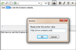
Enter the URL at the prompt; FormFusion will automatically insert the <a> tags around the selected text.
Click <a href="http://www.evisions.com">http://www.evisions.com </a>to visit the Evisions website.
If no text was selected, FormFusion inserts the anchor tags and positions the cursor in between them where the visible link text should go.
<a href="www.google.com">|</a>
Note that the visible link text must include the complete URL in order for the link to be clickable in FormFusion's PDF output.
Conditional
The Conditional button inserts a tag that will prevent all text enclosed within the tags from printing if a specified variable is null. This is not part of the HTML5 standard, but is a special code that can be used in FormFusion.
Clicking the button prompts for the variable:
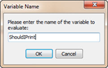
The tag looks like:
<evi:conditional variable="ShouldIPrint">This text will only print if the ShouldIPrint variable is not null.</evi:conditional>
Depending on the value of ShouldIPrint, the text between the opening and closing <evi> tags will either print or not print on the form.
Tab Toggle
The Tab Toggle button  does not insert an HTML tag. Instead, it is a toggle that changes the behavior of the Tab key so that it will insert a Tab character instead of tabbing out of the text edit area.
Insert Variable
The Variable Reference tab allows you to insert FormFusion variables into the text in the HTML object. Click on the Variable Reference tab to expand it, then select and drag the desired variable into the edit pane.
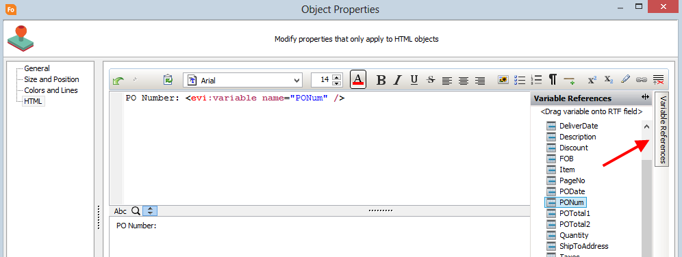
The code for the variable looks like:
<evi:variable name="PONum" />
Where the name of the variable is the same as the name of the variable in FormFusion. Note that the preview window will not display the variable contents; however, they will appear in the output at runtime.
Internal and Inline Styles
The HTML editor supports using standard HTML5 styles to change the look and feel of the various elements. There are two places you can apply styling:
- In a <style> tag in the header (internal stylesheet).
- As an inline style in the opening tag of the element.
The example below uses both an internal stylesheet and inline styles to develop the look and feel of the output.
Internal Stylesheets
The <head> section comes before the <body> and includes the <style> tag, which is where you declare any classes to be used in the body of the HTML document. Here, we are declaring a class called p.red, which will affect any <p> elements assigned to the "red" class.
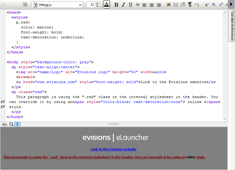
Within the body, notice the <p class="red"> opening tag for the second paragraph. All text within this paragraph uses the styling declared in the internal stylesheet for the p.red class. This is why the preview shows the text here as red, underlined, and bold.
Inline Styles
In order to make the word "inline" appear different from the rest of the text, we apply a local style to a set of <span> tags surrounding it. Local styles override any declarations in the internal stylesheet. Here, we change the color back to black and remove the underline for all text within the <span> tag:
<span style="color:black; text-decoration:none"> inline </span>
For more information and tutorials on how to use HTML and CSS, you can refer to http://www.w3schools.com/html/. This website is not associated with Evisions, but provides a good basic introduction to HTML.
A Data Field lets you insert a variable from MapForm or CaptureForm into the output. Once you add the Data Field in the desired location on the FormStamp, open its Properties to choose a field to display.
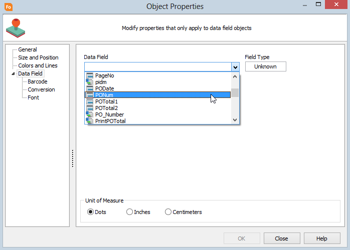
The Field Type will automatically update to indicate the data type of the selected variable.
Data fields have three additional screens where you can configure how the data should be displayed:
Barcode
The Barcode screen lets you choose a barcode encoding-- for instance, if you are using USPS Intelligent Mail barcodes on the outside of a mailer. The encoding transforms the data in the variable into the appropriate code for use with a barcode font. You must also choose the desired barcode font on the Font screen once the encoding has been applied.
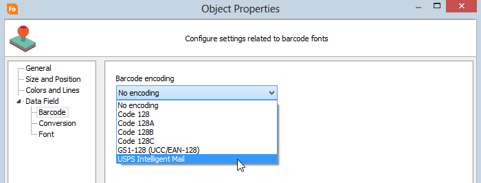
For information on configuring USPS Intelligent Mail barcodes in FormFusion, see Configuring USPS Intelligent Mail Barcodes.
You can download the Code 128 barcode fonts and the USPS Intelligent Mail barcode font from the Documentation and Software page of the Evisions website. As with all fonts, they must be installed both on the machine where you are developing the template and on the MAPS server. You must restart the machine/server after installation in order for the font to be recognized.
If you intend to create a pdf file or email the output, it is recommended that you embed the font into the output file such that the person receiving the pdf or email will not have to install the font on their computer. You can do this in the PDF Options in the FormDirector.
Conversion
The Conversion screen lets you apply formatting to the data in the field. For instance, if the field contains a number that should be represented as currency, you can select the Number/Currency option and then specify the desired format.
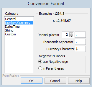
To open the Conversion Format dialog to help you build the format string, click the ellipsis button in the Conversion Format field, or press Alt-Down when the field is selected. You may also choose to type in a conversion format string manually using the instructions below.
Number/Currency Conversion
This conversion type should be used for numeric data (real or integer). When you select this type, configurable options will display on the right. You can control the number of decimal places to display, the characters used for the thousandths place, the character used for the decimal place, negative numbers display and the currency character.
Date/Time Conversion
This conversion type should be used for date field types. When you select this type, configurable options will display on the right. You can control how the date and time are displayed or if they should display at all. You can also control AM/PM status and the order in which the date and time are displayed relative to each other.
Summary of Conversion Codes
Following is a summary of the conversion format for hand-entering data conversions into the Custom conversion edit box.
This is the basic format (no spaces):
{pre characters} [ {conversion type character} {conversion codes} ] {post characters}
{pre characters}: Characters to display before the converted text.
{conversion type character}:
| Character | Description |
|---|---|
| # | Specifies numeric conversion. |
| D | Specifies date/time conversion. |
{conversion codes}: Conversion codes appear after the conversion type character and are separated by ~.
{post characters}: Characters to display after the converted text.
Numeric Conversion
For a numeric conversion, the substring following the pre characters looks like this:
[numeric conversion character A~B~C~D~E~F]
| Conversion Code | Description |
|---|---|
| A | The minimum number of characters to the left of the decimal place to print. |
| B | The negative number format, - to display a negative sign, ( to enclose in parentheses, [ to enclose in square brackets, { to enclose in curly brackets, < to enclose in angle brackets. |
| C | When minimum number of characters (A) is not met, this is the character to fill the space with. |
| D | Character to use as a thousandths separator. |
| E | Character to use as decimal mark. |
| F | Number of decimal places to print. |
Example:
$[#1~-~0~,~.~2]
The above conversion string will print the number -1234.5 as: $-1,234.50.
- The $ is the pre character and is followed by an open bracket [.
- The conversion type character is set to # to indicate a numeric conversion.
- Each conversion code is separated by a ~.
- A is set to 1 to indicate that there should be a minimum of one character to the left of the decimal place.
- B is set to - to indicate a negative number. Parentheses are also a common indicator for a negative; for example, -45 would be converted to (45) if ( had been used.
- C is set to 0 to pad the left side of the decimal with zeros if the number does not meet the minimum set in A. For Example, .45 would be converted to 0.45.
- D is set to , to use as the thousands separator.
- E is set to . to use as the decimal mark.
- F is set to 2 to set the number of places after the decimal mark.
- The conversion string ends with a closing bracket ].
- This string has no post characters. A post character would be, for example, a currency symbol that appears after the number (e.g. 75¢).
Date Conversion
For a date conversion, the substring following the pre characters looks like this:
[{date/time conversion character} [!][{format}^[{separator}]^[{format …}][~am~pm~]]
- ! - Used to signify 24-hour time. Leave out for standard 12-hour time format.
- separator - Enclosed in caret (^) symbols, this specifies the text to display in between format strings.
- am - The text to display for AM.
- pm - The text to display for PM.
- format - Any of the following formatting strings:
| Format String | Meaning | Possible Values |
|---|---|---|
| M | Month | 1 - 12 |
| MM | Month | 01 - 12 |
| MMM | Month | Jan - Dec |
| MMMM | Month | January - December |
| D | Day | 1 - 31 |
| DD | Day | 01 - 31 |
| Y | Year | example: 1 |
| YY | Year | example: 01 |
| YYYY | Year | example: 2001 |
| H | Hour | 1 - 12 or 0 - 23 |
| HH | Hour | 01 - 12 or 00 - 23 |
| N | Minute | 0 - 59 |
| NN | Minute | 00 - 59 |
| S | Second | 0 - 59 |
| SS | Second | 00 - 59 |
Example:
[DMMM^ ^dd^, ^yyyy^, ^hh^:^nn~ am~ pm~]
The above conversion string will print a date and time that looks like this: Aug 03, 2016, 09:05 am.
- There is no pre character defined.
- The conversion type is set to D to indicate a date conversion.
- Note the spaces and commas that appear between the ^ symbols. These determine the resulting string format. For example, MM^/^DD^/^YYYY will result in 08/03/2016.
Font
The Font screen is similar to the Text screen on a text object, and lets you choose the desired formatting options. These options will be applied to the entirety of the data within the data field.
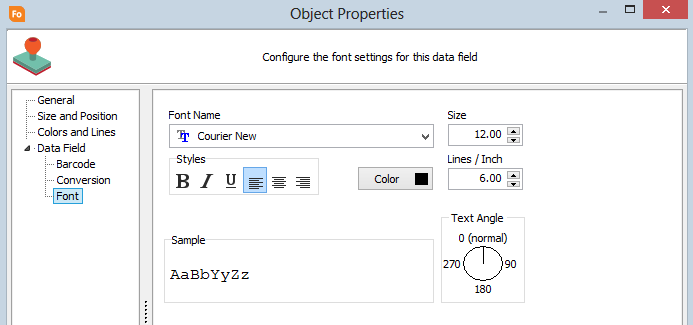
The available options include the font, font size, style (bold/italic/underline and left/center/right align), font color, lines per inch, and text angle.
An image is a graphical element used to display logos, signatures, watermarks, etc. Color or black and white images can be added to the form. The use of logos and water marks creates a professional appearance while the addition of signatures can reduce the amount of manual processing required.
FormFusion supports the following image file formats:
- JPEG (*.jpg, *.jpeg)
- Bitmaps (*.bmp, *.dib)
- GIF (*.gif)
- Icons (*.ico)
- Metafiles(*.wmf, *.emf)
- Portable Network Graphics (*.png)
- Tagged Image File Format (*.tiff, *.tif)
- Zsoft (*.pcx)
- TrueVision (*.tga)
To draw an image on a FormStamp you must first select the Draw Image tool button from the toolbar. Then, click the mouse anywhere on the form to open the Load Image dialog. Locate the image to load and then click OK.
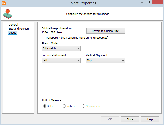
There are additional options when working with images. The initial width and height are displayed (as a reference) and a button is available to revert the image back to its original size.
Transparent
Check this box to allow objects behind the image to show through any transparent pixels in the image. Transparency works differently depending on the image file type. For .TIFF and GIF files, checking the "transparent" box will turn any white pixels in the image transparent. If you are using a PNG, you must make sure that the areas that you want to be transparent are actually using transparent pixels (verify this in your image editing program). White areas of a PNG file will be left white, not transparent. When using transparency, the PNG format typically gives the best image quality.
Stretch Mode
Allows you to specify how the object will handle being resized. The options include no stretch, full stretch, and keep aspect ratio.
Horizontal Alignment
Set the horizontal position to left, center, or right aligned.
Vertical Alignment
Set the vertical position to top, middle, or bottom aligned.
Adjust Image Brightness/Contrast
FormStamp has the ability to alter the brightness and/or contrast of any loaded image. To do this, right click on the image object you want to adjust. Choose "Adjust" and then "Brightness/Contrast". To learn more about this process click Modify Brightness/Contrast.
See Overlays and Multiple Copies for more information about Overlays and Overlays with multiple copies.
Working With Objects
Creating an Object
To draw an object you must activate the object-drawing mode by clicking the appropriate toolbar button for the object type.
Selecting Objects on a Form
To select an object, left-click on it. When an object is selected, it is highlighted and its sizing handles are displayed. You can select multiple objects by holding the SHIFT key down while selecting objects.
Moving an Object
Select the object(s) to move. Left-click and drag the object to its new position. To move an object in small increments hold the CTRL key down while pressing the arrow key in the direction you want to move the object.
Deleting an Object
Select the object(s) you want to delete from the form. Then click the Delete button from the toolbar, or press the DELETE key.
Resizing an Object
Select the object you want to resize. Click and drag a sizing handle until the object is the desired size. To resize an object in small increments hold the CTRL key down while pressing the arrow key in the direction you want to move the object. To resize from the upper left of the object hold the SHIFT key down as well.
Object Toolbar Buttons
There are several buttons on the FormFusion toolbar that relate to objects:
Changing Line Width (Lines, Rectangles, Text Objects)
To change the line width of lines, rectangles and text objects, select the object. Click the "Change line width" button on the toolbar. Enter the desired width (in pixels) and click OK.
Change Fill Color (Rectangles, Text Objects)
To change the fill color of rectangles and text objects, select the object. Click the "Change fill color" button on the toolbar. Select the desired color from the drop down list.
Locking an Object
To lock an object in place on a form, select the object. Then, click the "Lock selected object in place" button on the toolbar. This will protect the object from accidental mouse clicks and drags. You can still, however, modify the object using "Format Object."
Aligning Multiple Objects
There are eight different ways to align multiple objects. See the Alignment Toolbar section under Using FormStamp for more information.